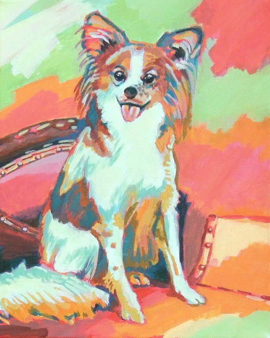

As with most paintings from photographs, I started with a simple grid to transfer and enlarge the image to fit the dimensions of my 8 x 10 canvas. No problems there. This work’s major effort was a short wrestle with color. For commissions, I ask for the client’s preferences for color, but sometimes get inadvertently locked into a three-color set that lacks interest. This time around, I obtained the base color preference, and constructed a roughly 5-color scheme around it using Adobe’s Kuler color-scheme generator. This turned out to be a great way to practice expanding my palette – I was unfamiliar with working with some of these, and wouldn’t have thought about combining them in this way! In the end, I added my own color “embellishments” to make sure enough of my own unique sensibility was imbued in the work. See the under-painting at left to see how I started with a bright base! Over all, I think this approach to color was a good technique for commission work, where client preferences need to be considered. Looking forward to see how it works with upcoming assignments.
- Comment
- Reblog
-
Subscribe
Subscribed
Already have a WordPress.com account? Log in now.

Great job Zach. Tamyra used to have that kind of dog. It was black and white and just passed away a few months ago. I should find a picture and have you paint one as a gift to her,