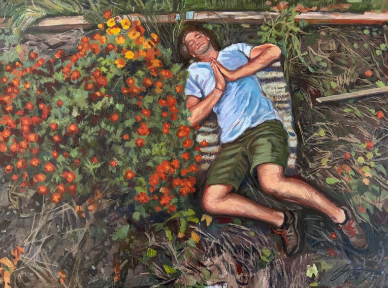
Self-portrait with marigolds. 2026. Acrylic on canvas. 18″ x 24″
After harvest, the garden grows sleepy. I too rest after raking out tomato, squash and zucchini remnants. Dry, twisted vines disintegrate to mulch as I pull. This season of colorful, chaotic growth unravels into quiet repose – a long, dusty exhale before the cold sets in. In this liminal dusk, a broad bed of marigolds still blooms brilliantly. Cousins to cempasúchil – flor de muertos – they burn defiantly in the midst of disruption and decay, they shine against the dying of the light. In my half sleep, I am filled with thanks for the fruiting abundance of the harvest, the turning of the wheel, and the little fires that light our way.
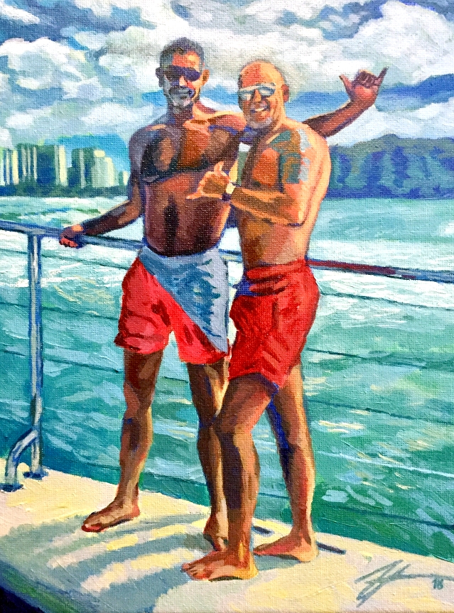
Portrait of Men on a Hawaiian Coast. Acrylic on canvas. 8″ x 10″
While I was not able to make it to any Hawaiian coast whatsoever during this summer’s vacation, I WAS able to live vicariously by painting one featuring this couple! I’m just wading back into my art life after being entirely consumed with purchasing a home, moving, and getting set up since mid-April. My studio only just came together one week ago! This was a fun portrait project to help get back into it after a long vacation from art. It also allowed me to deepen my skill in painting full-figure humans (versus dogs) in a natural setting.
Most enjoyable was the painterly, atmospheric background of clouds and waves in contrast with the meticulously placed daubs of paint here and there to capture the likeness of the subjects. I worked with a limited primary palette to mix all the colors, which I think lends a certain “pure” feel to the overall tone. This was the first painting completed in my new studio space, and I’m eager to move on to many more projects currently floating around in my head!
Check out the instagram posts below to see how this painting developed:
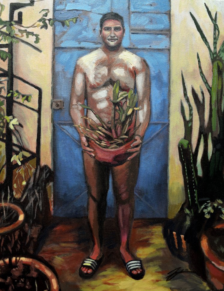
Self-Portrait (Oaxaca). Acrylic on canvas. 18″ x 24″
I haven’t posted much in the last few months as we have been completely consumed with the process of purchasing a home. That does not mean that I have not also been busy with painting! Over the next few days I’ll post a few of my recent painting milestones.
Our February trip to Oaxaca, Mexico inspired this self-portrait. The open-air courtyards familiar to Spanish colonial architecture were the perfect place to capture dramatic lighting. Many of the plants and cacti in our courtyard were wild and unruly, giving the haphazard space an “ugly-beautiful” feel, splashes of color surrounding us. From a technique perspective, I tried hard to paint in all the lights and darks, creating deep contrast, before I began working with color. Process pics below to see how the layers developed. Soon, the counterpart portrait of my devoted traveling partner will surface, but it’s still lingering in my imagination for now :)
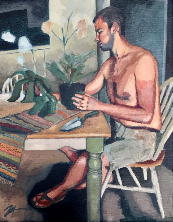
Mr. Jobe Surveying his Winter Orchids. Acrylic on canvas.
I started this portrait of my live-in, unpaid studio model on the Winter Solstice, intending to compose a painting that looks forward to warmth and growth during the cold, bleak Minnesota winter. I thought about styling this as a somewhat abstract, cubist composition, but was lured into classical representation instead. While this type of portrait is not necessarily my forte, it has been a fun and challenging project so far, and I’ve frequently found myself lost in the long moments of focus/meditation on careful color mixing, delicate glazing and developing depth. In the end, I want the subject to have a glowing, warm feel radiating from the center of the composition, in stark contrast with the hard, chilly light of the surrounding seasonal blues. As I work, I’m trying to channel portraits by Degas and Manet, to name a few. At this phase of the painting, I’m ready to break from reliance on the photo reference and deepen some stylistic elements, embellish the scene and let the visual poetry play out.
“It is all very well to copy what one sees, but it is far better to draw what one now only sees in one’s memory. That is a transformation in which imagination collaborates with memory.” – Edgar Degas
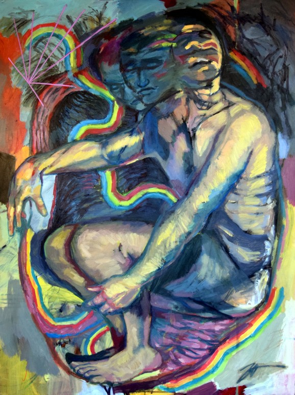
Resuscitation Rite (Self Portrait). Acrylic, ink and charcoal on canvas. 36″ x 48″
Incubation. Gestation. Uterus/Heart. Growth & Development. Ripening. Maturation. Evolution. Vessels & Hollow Organs. Heart/Uterus. Impulse. Creative Stream. Universal Generativity. Revival. Resurrection. Resuscitation. These are a few of my favorite things! And/or the wayfinding words I was jotting down in my project book/journal as I set out to rework a ten-year-old self portrait that just needed something more.
The former painting, a half-baked figure drawing of myself lying in semi fetal position, came from the tail end of my art school years when I was working on expressive figure sketches, mostly in rote, frothy charcoal and muddled with bright, concentrated color (see “Imaginary Figures”). Working through how to transform this piece into something I could be proud of was an interesting process. In many ways, I felt like I was having a conversation with my younger self, recognizing what I was trying to do 10 years ago, and letting that dialog with today’s sensibilities, changed as they are. I found that several of my old tricks and practices have endured and perhaps matured over the years. The same joy in speed and gestural energy is there in the old and the new way of working. I have a better grasp on color and inventive palettes now, something I really missed ten years ago.
As I worked through this painting I began thinking more deeply about what it means symbolically to come full circle on a self-portrait. I came across my desire to reinvent without fully destroying this object that my 22-year old self made. I’m reading a biography about artist Jasper Johns, and I was intrigued at a part of Johns’ career where he systematically destroyed his older work after he found his creative niche, erasing the traces of his incremental growth. I have certainly had the impulse to obliterate old paintings, but I so value the idea of ritual transformation that I find inspiration and meaning in the process, the traces leading up to a certain point in time. I like to see the arc of things. Perhaps I really am a “big picture” thinker – my partner mentions it frequently. I remember how lost I felt at 22, facing graduation and the bleak world outside art school, and I wonder if that uncertainty contributed to the savage, transitional quality of the original image. I wish then I could have seen the long view and trusted it. It sounds so sentimental…I tried to have a little overdue self-compassion as I helped this old portrait find a way out of confusion. The result is a somewhat spiritual (if not a little corny), surrealist affirmation of our constant state of change and transformation, a theme that is ever more important in my art practice and my perspective in general.
“I think that one wants from a painting a sense of life. The final suggestion, the final statement, has to be not a deliberate statement but a helpless statement. It has to be what you can’t avoid saying.” – Jasper Johns
Lepomis gibbosus (Pumpkinseed Sunfish). Acrylic and ink on canvas. 12″ x 16″
I’m closing out 2017 with this playful painting of Lepomis gibbosus, the Pumpkinseed sunfish. Also known as pond perch, common sunfish, punky, sunny, or kivver, these freshwater fish of the Centrarchidae family can be found in many of Minnesota’s lakes and streams. A coworker of mine has a fishy theme going in her baby’s crib room and asked for a fun, fishy piece to go with it. I decided to channel the Pumpkinseed’s likeness for its playful colors and goofy, chunky shape. Fun fact: the Pumpkinseed uses uniquely adapted teeth to feast fancily on escargot!
Beyond fish, 2017 has been a smashing year of art progress for me. Reviewing the last twelve months in my art journal reveals so many successes. So much having happened, I felt the need to reflect on the year in a blog post to capture all my thoughts in one place. In my formal art practice, I have achieved my goal of working with higher contrast, more risk-taking and experimentation with color, and creating the illusion of depth more effectively than ever before. I explored ways of working that I was not entirely comfortable with (cubism, landscape, realism), challenging myself and interrogating my own assumptions along the way. I showed new and old work in three different exhibitions. Additionally, I crushed my previous records for commission earnings, having finished ten distinctly unique pieces of increasing size and complexity. Lastly, and most valuably, I became a member at Vine Arts Center, and joined a committed and dynamic collective of artists working to bring art to the Twin Cities community in a variety of fashions. This has allowed me to more fully submerge myself in art dialog and discourse, an energizing and renewing process. A big factor contributing to this progress is at long last I have the right work-life balance required to generate new art and keep up with marketing it. Thanks, nursing school! Finally having a dedicated studio space is also a mega factor in the equation, not to be overlooked. Most importantly, there are people around me who support my art, come to my shows, ask good questions about my process, and get excited about what I’m making next. Art is a conversation – I am deeply appreciative of everyone willing to have that conversation with me.
Alongside these successes, there were a few goals I did not meet. I had good intentions to participate in community art events and collaborate through shared projects. I ran out of time! Moving into 2018, I hope to ratchet up my arts involvement by participating more in community art events. I also may have worked too heavily on commissions and not pursued my own creative projects fully enough. With many ideas floating around in my head, I’ll be sure to find a way to get more of them onto the page, paper, board, canvas, or what have you in 2018. Another goal I have for 2018 is to find a way for my art to add value or perspective to the conversations happening all around us in our social institutions, our media, or political theatre, our environment and universe at large. With all this in mind, I must remember to stay humble, to focus on the core of what energizes me about art, and to keep talking about art with anyone and everyone.
Oh, and one more non-art-related resolution: to get out there and eat all the escargot I possibly can, preferably with some uniquely adapted teeth.
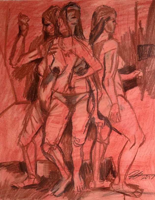
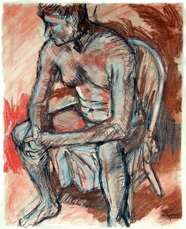
Three Figures. Acrylic, ink and charcoal on canvas. 24 ” x 30″
Coming in the midst of a furious week of art production, here is the formal result of my recent research into cubism! This commissioned piece moderately deconstructs three poses (one model – unharmed in the production process) and the studio space around them. I treated this subject with all of the cubist sensibility I was able to scrape together from online searches, a visit to the Minneapolis Institute of Art, and biographies of the likes of Pablo Picasso and Georges Braques. My final composition borrows heavily from Picasso’s bold “Demoiselles d’Avignon” and samples the palette of Picasso’s blue period, Braque’s somber spectrum, and adds an iridescent gold flare because decorative art!
This being my first relatively abstract, non-photographic commission piece, the ideas and prototypes came together through consultation. Trading pictures of murals, famous paintings, and devising color schemes, we carved out a shared mental model of the painting to come.
I began working on this piece by reading and observing. I was curious to find out what my giant art history textbooks, the internet, and our local free museum had to say about cubism. I was surprised to find that certain aspects of cubism were similar to what I was trying to do with “time-lapse” figure painting in the latter half of my art school years, so picking up that line of work felt a bit like coming home. Read more on what I found out about cubism’s “greater context” here. Once I had determined how cubist sensibilities could fit into my style, I invited over a friend to model for some gestural sketches. These loose and expressive sketches helped me form the basis for the figures and I built up the geometric environment around them. From there, the challenge became walking a thin line between decorative, calculated abstraction and representational figure painting, my client preferring something in the middle. See process snapshots below.
I could go many directions from here in order to fully invest in this way of working. Some cubists section off the surface in such a way that objects and bodies are barely recognizable, obscured by geometry and the conceptual/perceptual notions of cubism. Which to me is less interesting as I am still in love with drawing and painting the human body. Another idea is to fully push the idea of poses changing through time. I recently attended a figure drawing cooperative at a local art academy, and wondered how I could incorporate all the 5, 10, 15 and 20 minute poses over four hours into the same composition. The final result would probably be something quite abstract but also quite recognizably human. Overall, I have befriended cubism and feel like I’ve grown a bit as an artist after examining and producing in this way. I’m eager to get deeper into the water.
Three Figures. Charcoal and conté crayon on drawing paper. 14″ x 17″
Here is a preparation piece/study for an upcoming project I am doing for a friend. I had another friend model and tried to render the figures in three separate perspectives using a cubist sensibility in my analysis and reworking of the visual field. I am so satisfied with this composition and treatment of the figures that I am considering making a full-size painting out of it, but perhaps it is best left alone as a study.
I started reading about cubism in the past couple of weeks to understand the theory behind this distinctive style. While I have not always been a fan of the blocky, dead-feeling paintings of Georges Braque and Jean Metzinger, the cubism of Picasso really speaks to me, perhaps because it seems almost decorative in the same vein as Gustav Klimt, alive with color and movement. What I found in my reading described the cubist’s attempt to portray a greater sense of reality by presenting a subject from many sides/perspectives, and in turn creating with the visual field a “greater context” around the subject for the viewer to have a fuller experience of the art. Within cubism’s paradigm is also a theme of temporal shift, with a subject changing slightly through different points in time. This last idea struck home with me as I recognized my own interest in early attempts at “time lapse” painting, which I termed “progressive” painting at the time. What I find fascinating about cubism is the attempt to imbue the static media of paint with the inherent transitional qualities of living structures in time and space.
Working and thinking through cubism comes at a time when I try to find a “greater context” for myself, both in my art and life in general. My RN job is challenging but I’m finally creeping up the learning curve and trying to get more involved with our unit. I’m reaching out my feelers for arts organizations to volunteer and contribute in meaningful ways, instead of painting in obscurity. As Summer fades, I feel a slight pressure to get more irons in the fire to keep me busy and warm through the long Minnesota winter.
Bather at Holland Lake. Acrylic and ink on canvas. 24″ x 36″
Here is a painting of my cousin’s little girl wading into Holland Lake, a favorite swimming spot nearby our family’s cabin in northwestern Montana. The Swan Valley and locales along highway 83, located between the Swan and Mission Mountain ranges, hold special significance for our family. Many generations of kids have swam in Holland Lake or hiked to its falls, collected its thimble berries and careened at high speed on a giant inflatable crocodile over its mini whitecaps. I was excited to take up this project because the composition marries majestic landscape with figure work, and works easily with all the expressive brushwork I love to do.
I started this piece with a simple grid to transpose the image basics, then filled in everything with a rich pink underpainting that manages to shine through even the final layers of paint. The Swan Mountains are known for summer forest fires, and the smoky haze can bend the evening sun in such a way that the horizon flushes the same deep pink of a cutthroat trout, washing everything in this dramatic rose tone. I wanted to channel that fluorescence in a subtle way without the final piece appearing too dream-like. Find process pics here: https://www.instagram.com/atelierzjt/
The most vexing part of this work was the sky and clouds – it was difficult to make them “fit” with the rest of the painting. Clouds in most reference photos are not exactly aesthetically pleasing. I could benefit from doing some plein aire cloud studies to get a knack for this. As usually happens with my paintings, there were several points where I wanted to stop and leave the surface alone because I saw a particular vibration or movement that I did not want to overwork or blunt. My sense for when this occurs is getting keener because I am beginning to understand what exactly is exciting for me in this media. For work like this, the key is finding the intriguing balance between stylization and realism, tension between abstraction and representation.
Portrait of Ms. Blank. Acrylic on canvas. 18 x 24.
“Hello, I’m Jerri Blank and I’m a 46-year-old high school freshman. For 32 years I was a teenage runaway. I was a boozer, a user, and a loser. My friends were dealers, cons, and 18 karat pimps. But now I’m out of jail, picking up my life exactly where I left off. I’m back in high school, living at home, and discovering all sorts of things about my body. I’m finding out that though the faces have changed, the hassles are just the same.” – Jerri Blank, Strangers With Candy
This immensely fun portrait of Jerri and her white Japanese silky “Suki” has been a great exercise in portraiture. I was glad to pick up this project for a friend, as I have always been inspired by Ms. Blank’s story of turning your life around and also recognizing that change is hard (no matter how hard you try). Jerri is also a master of transforming salacious, immoral natural weaknesses into personal strengths. In Jerri’s own words: “I’m dealing with this the same way I dealt with my own alcoholism and drug addiction… with lies and delusion.”
My favorite part of this piece was working on Jerri’s startling, charming face. Her tired, experienced eyes reflect her time in Florida’s “harsh” penal system, glassy from all-night benders in X trailer park. Her cracked and quixotic smile with spastic lips from years of eating glint and whatever else was unlucky enough to meet her mouth. Finally, her ornate floral blouse adds to her crooked splendor in this definitive portrait of Ms. Blank and Suki the Japanese silky.
Seriously though – this represents my first true attempt at straight portraiture of the human species, although my friends originally considered this their pet portrait! Poor Jerri. It’s amazing how the slightest alteration or shift in a facial feature can completely throw off the recognition factor or make something look odd. I discovered that human portraits require a great deal more precision than animal portraits. Another process I worked through was building up the skin in layers. There are so many colors and tones inherent in the skin, and not all of them are distinct yellows, reds, tans, etc. If you look at your own hands now, you will see the majority of your skin reflects a transitional gray tone, depending on the lighting. Finding the balance between tone and depth in Jerri’s face and hands was a challenge. I’m excited to take on more portrait projects so I can keep exploring how to paint human skin.
Figure & interior study. Acrylic and charcoal on canvas. 18″ x 24″
Returning to figure work with this study of a certain live model in my partially re-packed apartment a few weeks prior to moving. It is beyond exciting to come back to the classic and familiar gestural sketch of art school, and then combine that sensibility with my slow but eager, semi-abstract exploration of figure in relation to space and place. I’m trying hard to transmit how the sunlight filtered by the tree outside my window washes into and fills up my living room, now rendered a “transitional” space as recognizable domestic shapes are packed up and stacked in boxes and piles to the right. Transition or “interval” is central to my exploration of the time inherent in painting. This piece reminds me of an older figure study, but my risk-taking with color has certainly evolved. A time of change is ripe fruit to crack open, let the creative juice flow.
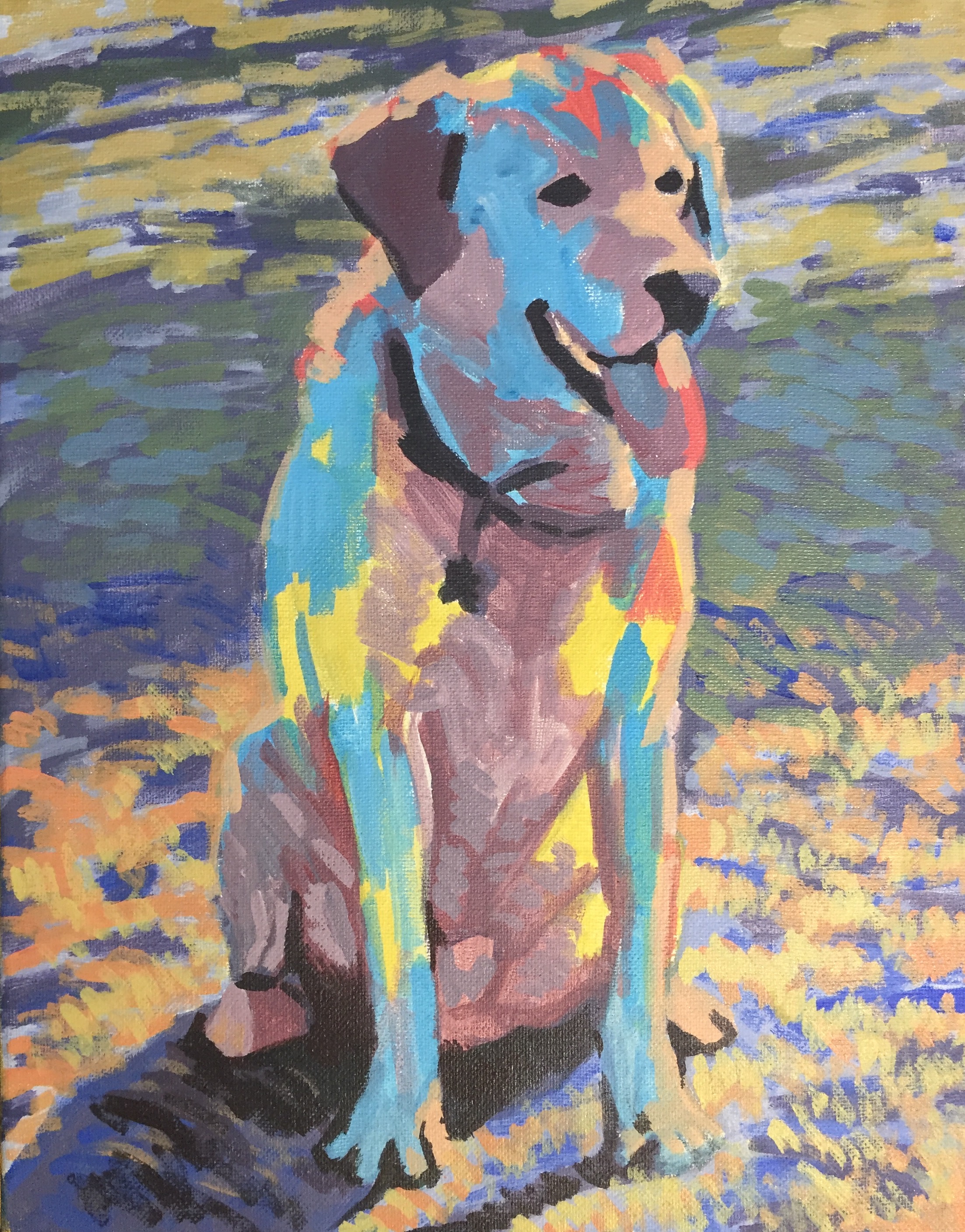
Working on this pet portrait commission in the hours between three consecutive night shifts! A vibrant underpainting and loose, expressionist style is giving me ample room to explore simple depth and intermediate tones. I’m trying to mix color quickly and intuitively to avoid the traps of overthinking. The result is so far quite beautiful and reminds me of Van Gogh or Paul Gauguin palettes.
Today I am wrapping up this colorful portrait of Oreo, my coworker’s adorable bichon poodle (Poochon?) I began this piece with a standard grid and built into a loose, colorful underpainting. From there, I made small adjustments until the colors were just right to match my colleague’s home decor, jumping off the canvas in high contrast sage, rust red, sunny yellow, and umber-stained cerulean. As I have done in previous work, I developed a color palette using Adobe’s Kuler tool with input from my client, then worked within those tones as I layered using the “heavy over lean” technique.
Beagle Beneath Blanket. Acrylic on canvas. 8″ x 10″
I received this portrait commission a few days ago, and had fun with the composition and colors! The most challenging aspect was converting the neutral gray tone of the uppermost comforter into more visually appealing hues. The lines and shapes of the drapery challenged me to concentrate on the drawing through all stages of the piece. While putting on the final layers of paint, I actively worked against my instinct to preserve thick, dark, illustrative lines around everything. This tendency is evident in many of my other paintings, and I believe it originates from my “comfort zone” of line drawings. Other considerations: working on creating the illusion of space and depth, as much as a zoomed puppy close-up will allow. See the underpainting below.
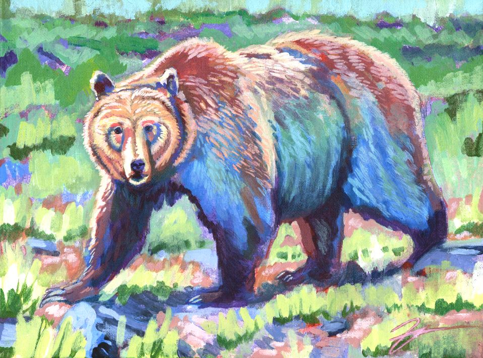
Ursus arctos horibilis. Acrylic on canvas. 9″ x 12″
Growing up, we spent two weeks every summer hiking in the Southern tip of grizzly country, the Mission and Swan mountain ranges of Northwestern Montana. Crashing through the mountainside bramble towards the high glacier lakes, we watched for the bear signs: slobber on the huckleberry bush, foul-smelling scat full of indigestible berry husks. We wore jingling bells to reduce the chance we might surprise a foraging bear, carried one loaded magnum in case the worst transpired. At the cabin, we devised an elaborate “bear escape” plan, should our homestead become the target of a hungry ursine burglar. Pervasive in our Montana stories, the grizzly bear was (and still is) a powerful and ominous force in the back of our minds. Luckily, we have not yet initiated the bear escape plan, nor required the loaded magnum on the trail! Continue reading →
A mini portrait of my cousin Kirstin, preparing for her first baby, who will arrive in the next few weeks. I first met toddler-Kirstin at a wedding – she was a curly-haired fireball in a white skirt, and we tore it up. Growing up, Kirstin and I sketched gargoyles, invented games with old tools in the garage, pretended to be mer-children, strung wild daisy-chains, plucked handfuls of Indian paintbrush bouquets for Grandma, terrorized our little sisters, hiked in the mountains, and choreographed dances to Disney movies, Ace of Base. The hard, inevitable facts of growing up make these kid memories sweeter. In reflection, these scenes seem to be from a different place – an alternate reality bordered by long hours, long summers, recesses, a cabin in a valley, and family gatherings with Kirstin’s mom’s fabulous cheesy potatoes. Despite the oft-bleak adversity of adult life, not all is lost – when we catch up today, we revert to our goofy childhood selves. Thankfully, we can remember. Mostly, we laugh!
Seated figure (study). Conté crayon, charcoal on heavyweight paper. 14″ x 17″
Finally finished this figure study I started ~ 14 weeks ago. This work captures the naked likeness of my favorite model, hanging out in the sunny corner of my makeshift studio space. Since completing the study, I have moved on from this composition to a few other rapid figure drawings/paintings, which has been great practice in formal figure drawing skills. During a recent chat with the model pictured here, the topic of school words came up. I have not the faintest idea about my university’s motto(s) or words; in the past eight years I’ve attended six schools and feel decidedly disconnected from any alma mater. In contrast, his school experience was more Hogwartsian, and part of the university’s legacy is in its words: ideals to action.
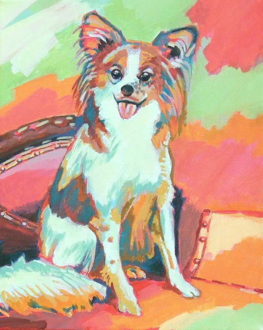
Martini. Acrylic on canvas. 8″ x 10″“Martini” is a commission for a colleague in need of a Christmas gift for her mother! This pup is a member of the Papillon breed – the name is French for “butterfly,” referencing the breed’s distinctive outstretched ears and stringy hairs that trail below. Continue reading →
Percy. Acrylic on canvas. 8″ x 10″My grueling Summer semester is almost over, meaning I can soon dust off my easel and re-connect with my other journey of art! Here’s Percy, the family pet of my friend Emily’s brother. I had lots of fun with texture and color on this one… I’m getting pumped to paint more animals in the very near future!
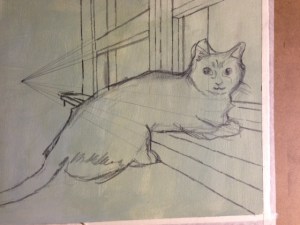
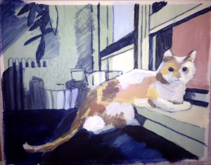
Monster portrait. Acrylic and graphite on heavyweight paper. 11″ x 14″
No longer unfinished art as of 5/21/15. This cat face was a nightmare! It feels so good to peel off the tape and see the crisp white borders and put a little signature at the bottom :) Satisfaction. At left: progress on cat portrait… The graphite plan and under-painting. Layer-by-layer glazing approach helped build up colors and thicker surface of the final painting. The biggest challenge here was getting the paint cat to resemble the real cat – minor variations in face structure and lines have a huge impact on recognition, just like on human portraits!
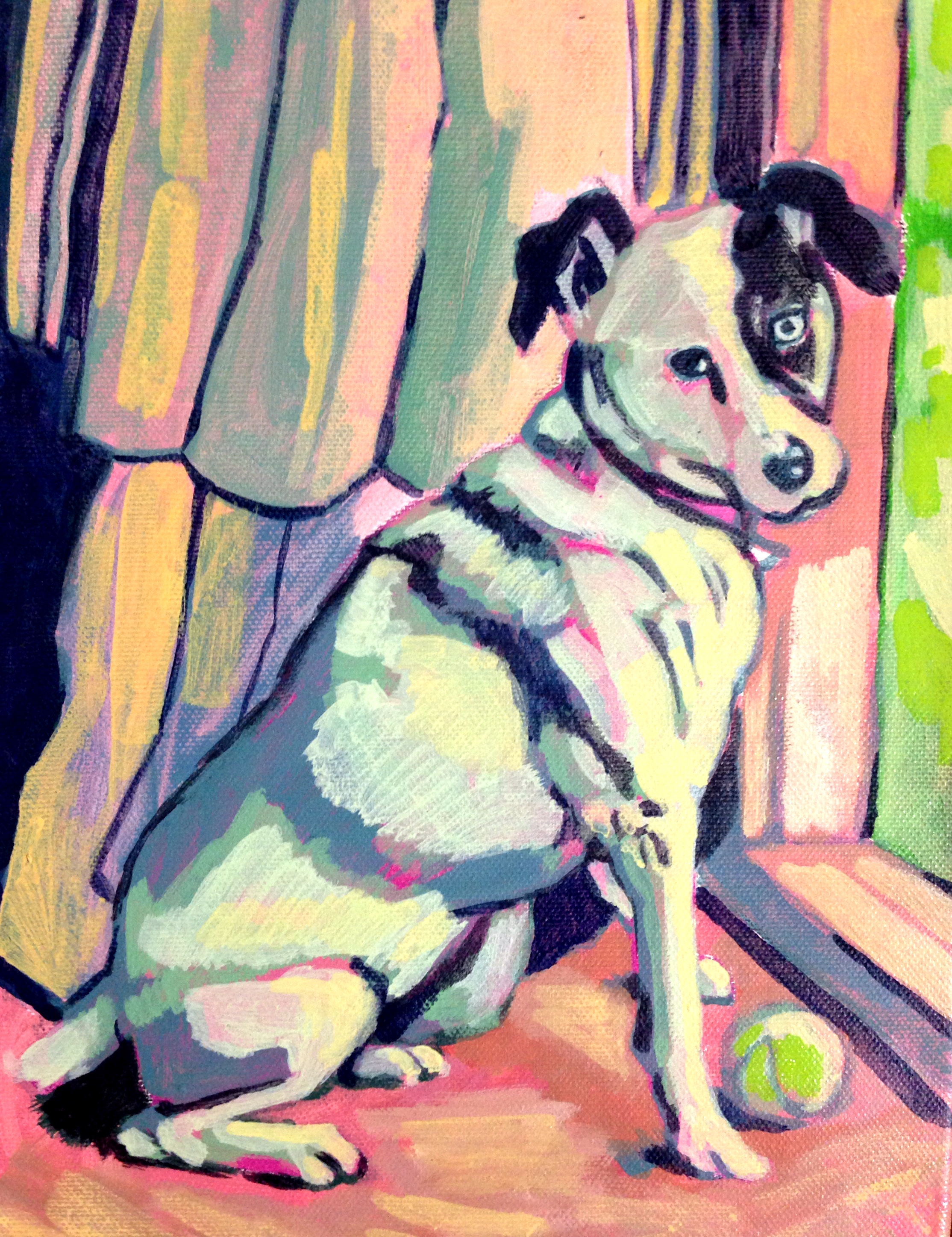
Untitled (Commission). Acrylic on canvas. 8″ x 10″Starting off my pet portrait commissions journey with this fun small-format piece for my boss. I think it’s supposed to be a Jack Russel terrier, and maybe the pooch has some other genetic factors going on.
Study, Pregnant Woman. Charcoal and conte crayon on drawing paper. 14″ x 17″
First live model session in my home studio setup was very successful. I kept thinking this must be one of the only occasions during which one can acceptably sustain eye contact with another human for more than a minute. Or even several seconds.
Truth: it is hard to find time for painting in the crush of full time work and full time school. Fortunately, another truth exists: the harder it is to find time to paint, the more I want to do it, and I fantasize about long hours with my easel, surfaces, brushes… Knowing my capacity for hedonism, I shouldn’t worry about losing my craft. But starting this piece, I was more than a little wobbly getting back to the process. For now, this is just an under painting, and I’ll be working on layering in richer color, more exacting line work, a truer depiction of my friend in the foreground. The stiff, scary Chucky Doll face I unintentionally rendered will need to be worked over. The distinctive bridges in the background create movement and ground the portrait in Minneapolis and the Mississippi. Continue reading →
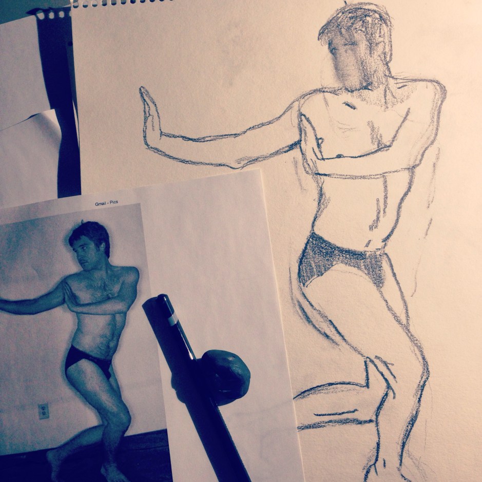
Working on my figural game, from this morning (finished drawing above) … These days I have to squeeze art in where I can find moments of free time. The pose is a variation of a kung fu stance. Figure work will always be my true love!


